OVERVIEW
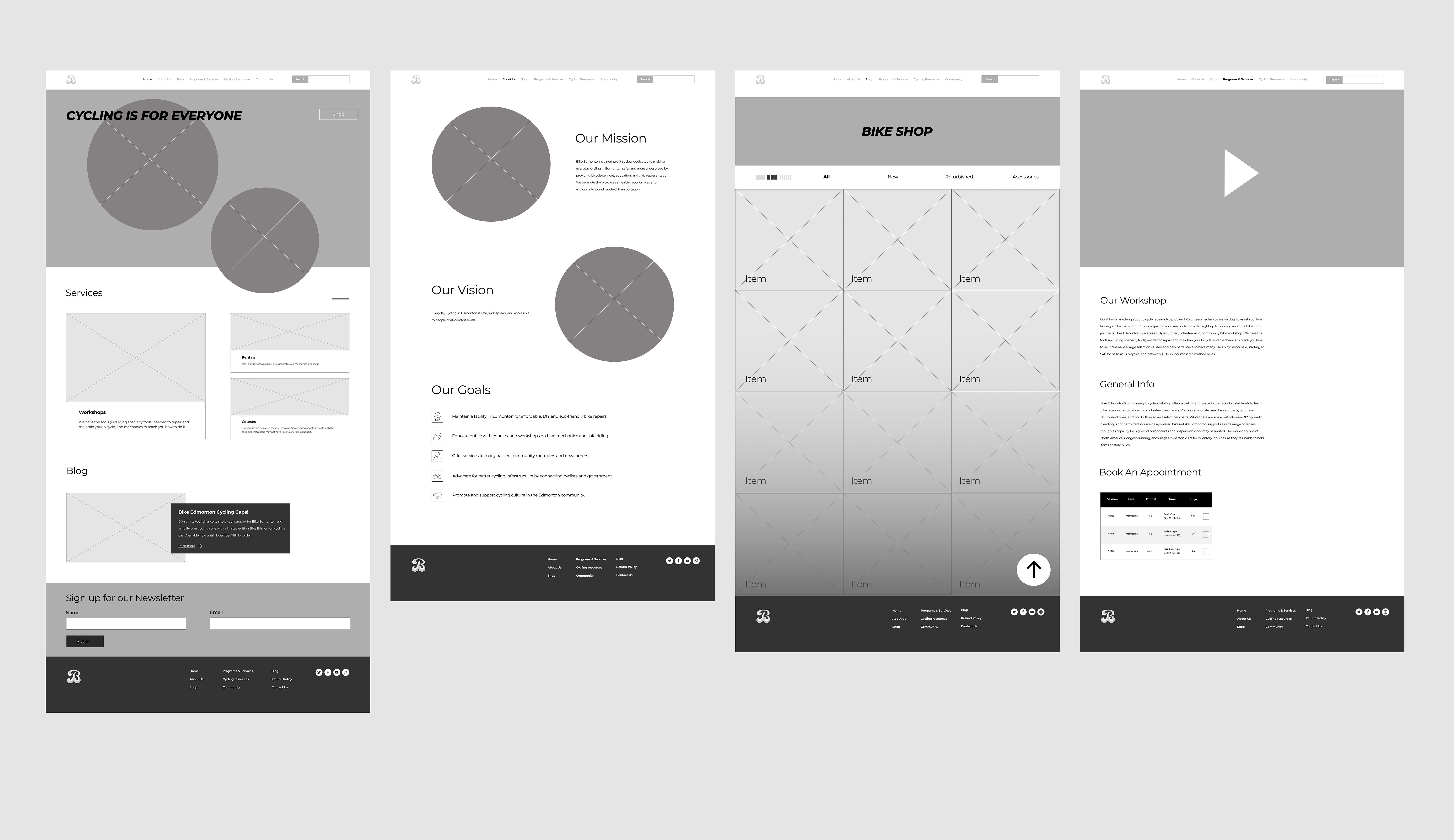
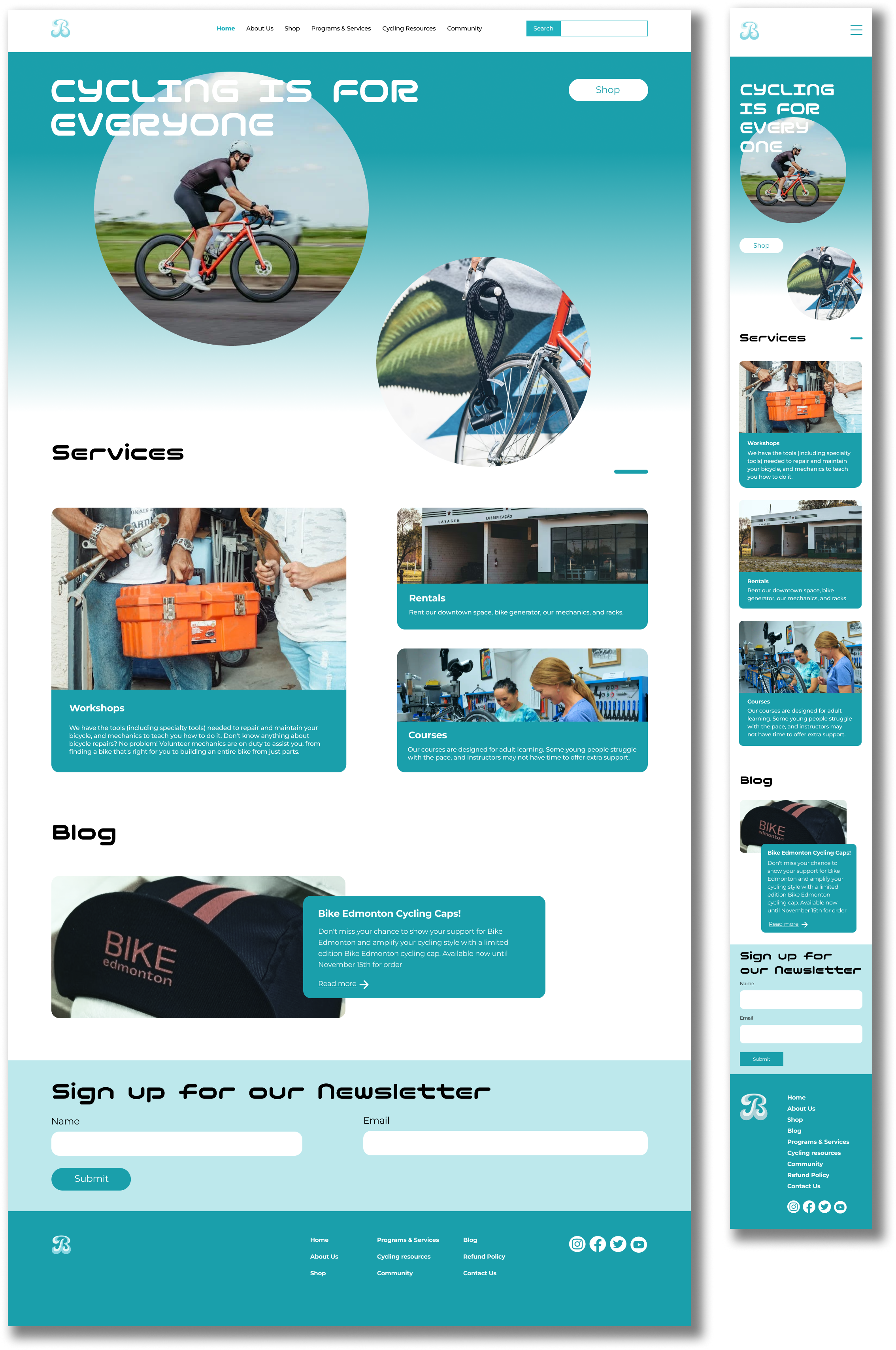
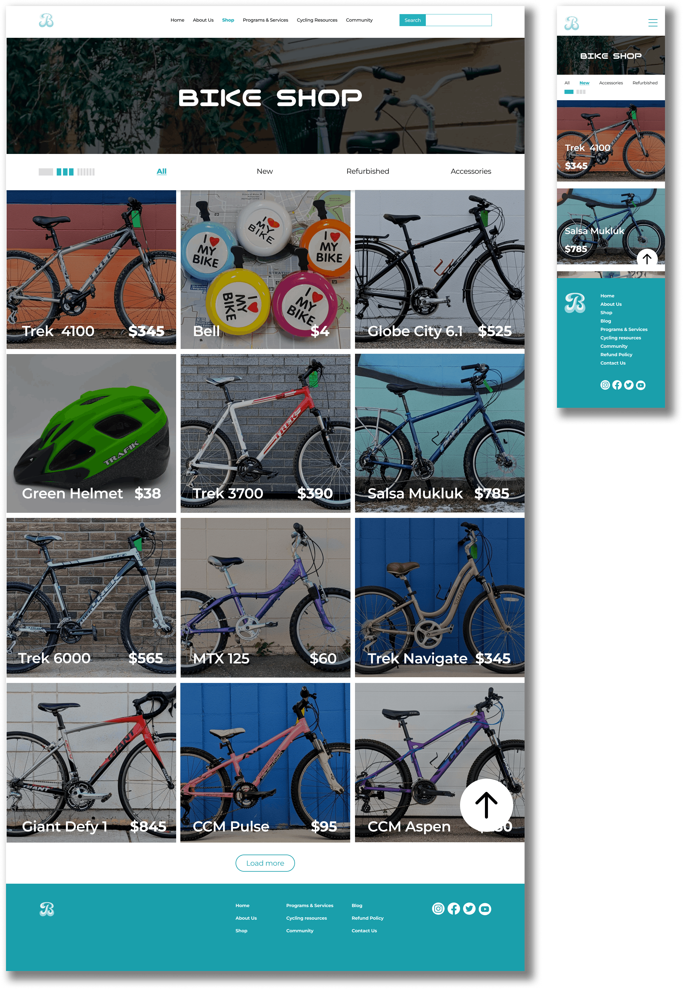
The Bike Edmonton website needed a clearer visual hierarchy to guide users effectively and make information easier to navigate. Excessive categories cluttered the experience, while the sidebar navigation lacked appeal, and some sub-navigation links were out of place. Misleading or redundant statements in the "About Us" section, such as “teach you to ride,” were removed in the new sitemap for clarity. The homepage was improved with more engaging visuals, like a hero image, to communicate the organization’s purpose immediately.
Excessive white space and uneven navigation margins were addressed, and key content, such as services, was prioritized over blog posts for better usability and focus. Lastly, the website coding was updated to incorporate elements like alt tags and HTML semantics.
TOOLS
FIGMA
GITHUB
HTML/CSS